athenahealth
athenahealth

Patient Portal

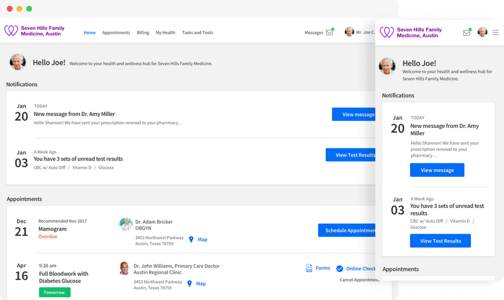
Redesigned patient portal dashboard on desktop and mobile

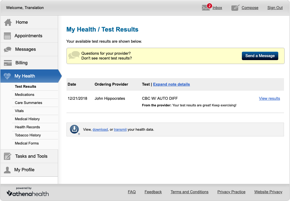
25 million patients opened the portal and landed on Test Results.

Appointments, meds, billing — all there, none of it findable. Especially on a phone.

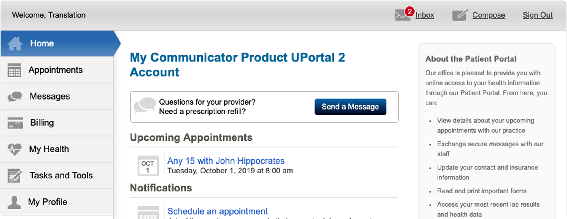
Legacy My Health page — Test Results only

This was home.

So I made a real landing page and health overview page.

One dashboard. What matters up top. A clear path to everything else.

My Health Landing – After

The nav had the same hole.

People couldn't find things. Card sorts had no consensus. It had to work on a phone.

Legacy patient portal navigation

Seven links. No small-screen version.

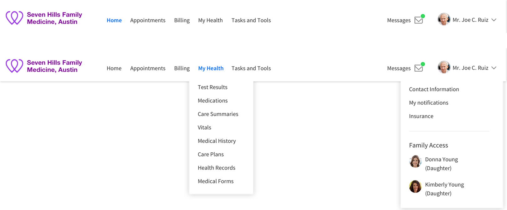
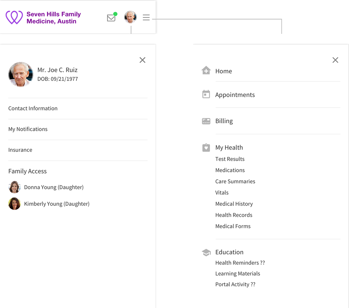
Cut the repeats. Make it respond.

Desktop navigation — dropdown menus
Mobile navigation drawer — account panel and main menu

Same structure on desktop and phone.

A patient using the portal from home

Usage

25M patients

Registered on the portal

Time saved

40% faster

Time to find appointments, meds, and billing

2 taps

From landing to the next action on a phone

Support

28% fewer tickets

“Where is my...” support contacts

The Team

  • 1 Senior Product Designer · IA lead
  • 2 Product Managers
  • 3 Engineers

Timing

  • 2018–2019

    IA, dashboard, and responsive nav

  • 6 weeks

    Unmoderated tests + card sort

Tools Used

  • Figma
  • Gemini
  • Jira
  • Miro
  • Pendo
  • UserTesting
  • Cursor

Up next — Volusion

Volusion

Volusion Ecommerce Admin