athenaWell
athenaWell

Standalone apps for patients and care teams
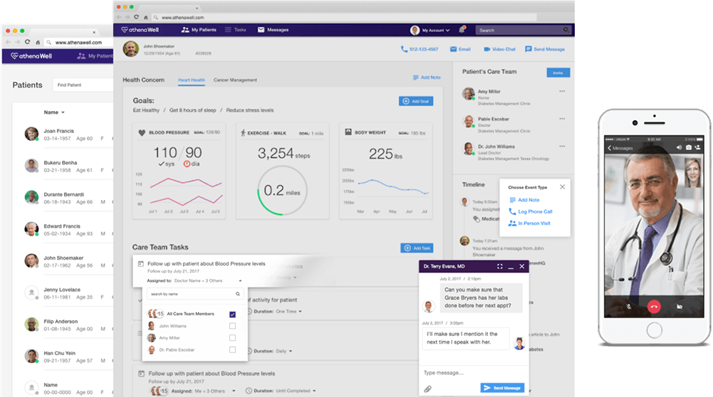
A patient hub for care plans, daily progress, and education

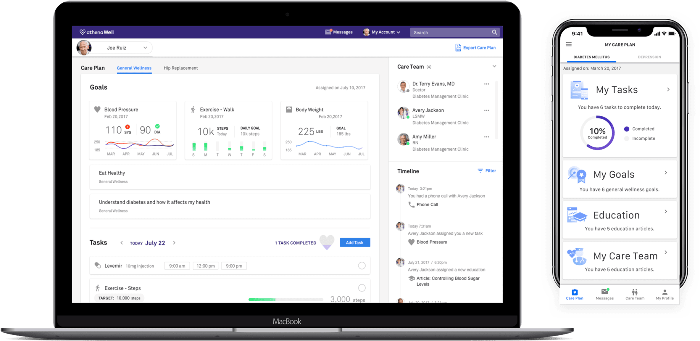
The athenaWell care plan on a laptop and the patient app on a phone

The care plan lived in a paper folder.

A patient seeing several specialists had their plan spread across phone calls, folders and systems that didn't talk. Care teams needed one place to build and track it. Patients needed to know what to do today, and how to reach someone.

So the plan moved somewhere both sides could see it.

One place for the care team to build, assign and track a plan — and one daily view for the patient of what to do today, with a direct line to the people who assigned it.

The Care Plan — conditions, goals, daily tasks and the care team, on one page.

athenaWell Care Team section — testers were drawn to the video chat option

Care Team section — testers were especially drawn to the video chat option

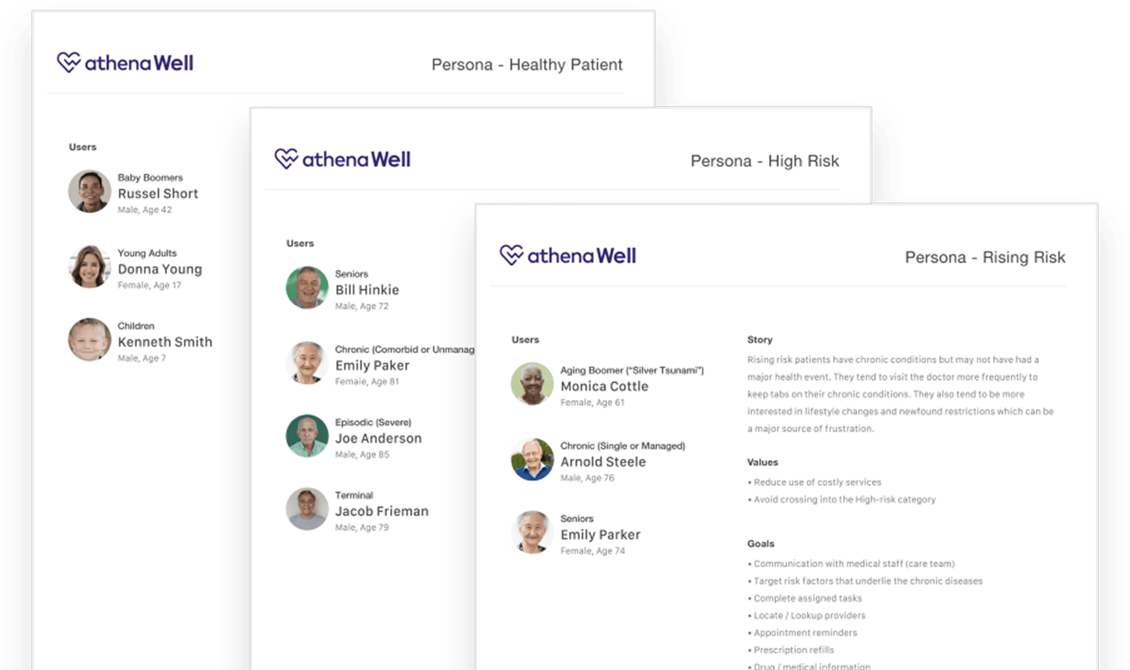
Three patients, one plan to hold them all.

Designed for three risk tiers rather than an average patient — each with its own values, goals and pain points.

Healthy

Visit the doctor twice a year for general checkups. Genuinely interested in tracking sleep, meals, step count, and exercise — and sharing that data.

Rising Risk

Managing a chronic condition without a major health event yet. Frequent doctor visits, and lifestyle changes are a real source of frustration.

High-Risk

Known by the care team on a first-name basis. Juggling multiple specialists, mounting medical bills, and no single place to turn when they need help most.

The three athenaWell persona documents — Healthy Patient, High Risk and Rising Risk

The persona documents — users, story, values and goals for each risk tier.

Education content mapped to each patient's specific health concerns

Education content mapped to each patient's specific health concerns

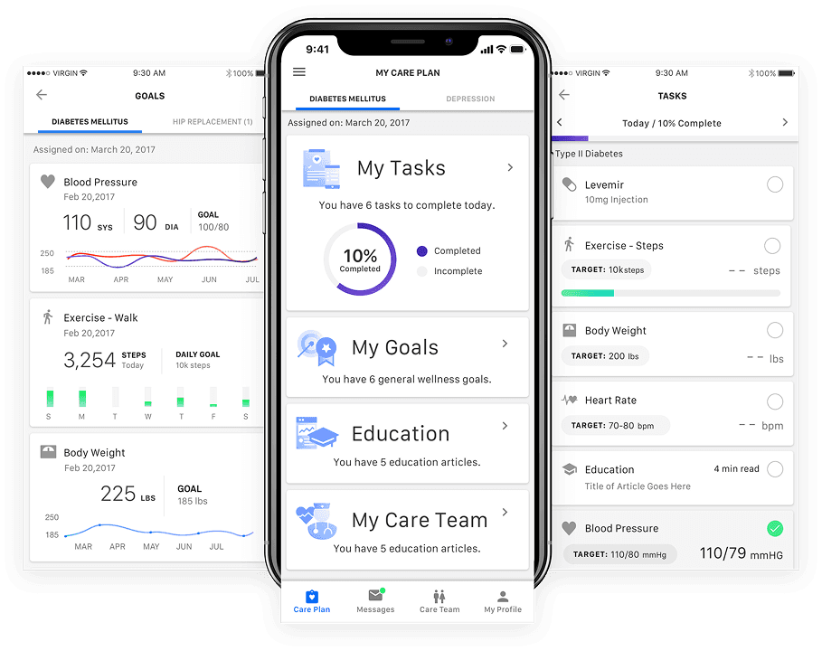
Daily patient tasks with a progress indicator testers found motivating

Daily patient tasks with a progress indicator testers found motivating

One assumption didn't survive testing.

Five interviews, walking each person through a working Care Plan prototype. I expected the tabbed plan to confuse people. It didn't — testers preferred it, so it shipped as designed.

A question answered without the phone queue.

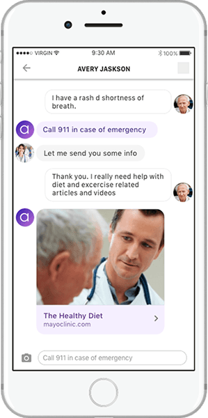
Apollo, the chat bot: reactive messaging with event-driven AI assistance, so reaching the care team didn't mean waiting on hold.

Care that reaches past the clinic.

Patients needed easier ways to reach their care teams. I designed apps that brought visits beyond the clinic — virtual, phone, and flexible scheduling.

The athenaWell icon set — twenty-four drawn icons

Custom icons — one drawn set across care plans, scheduling, messaging and results.

The plan reported on itself, daily.

A daily task view — check-ins, surveys, education — with a progress indicator testers called out as the motivating part.

What it shipped with.

Patient personas

3 risk tiers

Resonance interviews

5

Wearable integrations

200+

Wearables through Validic; education content from Mayo Clinic, NIH and epocrates.

The Team

  • 1 Senior Product Designer
  • Care team engineering
  • Clinical content partners

Timing

  • 2017–2018

    Care Plan design & validation

  • 5 interviews

    Resonance-testing round

Projected Numbers

  • 3 personas

    Healthy, Rising Risk, High-Risk

  • 200+ integrations

    Wearable partners via Validic

Tools Used

  • Figma
  • Miro
  • Jira

Up next — athenahealth (acquired)

athenahealth (acquired)

Patient IO